The brief
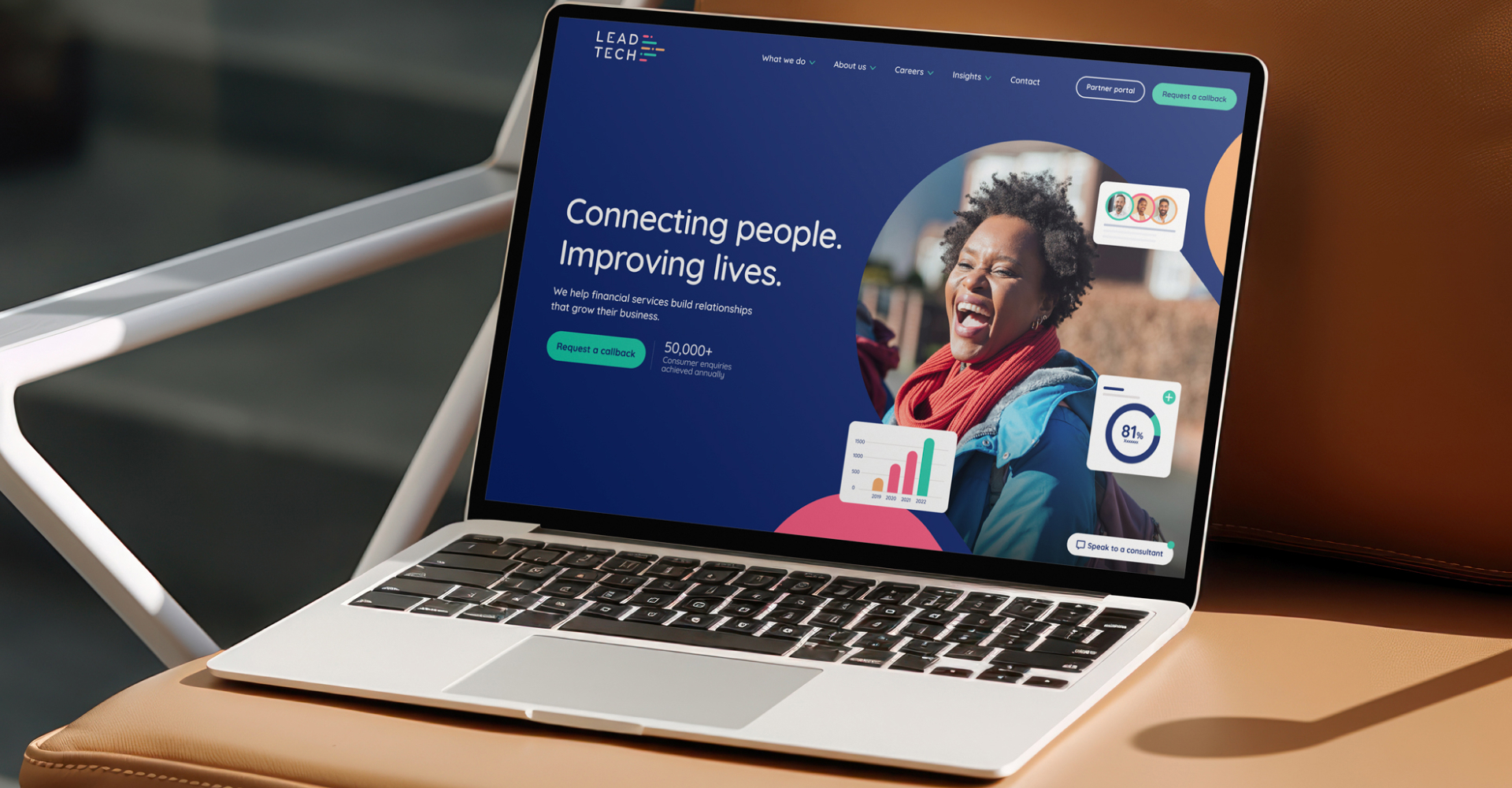
After 15 successful years, it was important the new LeadTech website supported their ambitions to grow their market share within the financial advice sector even further.
It would also be the first showcase of their refreshed brand identity as well as completing the company’s overall transition to using Umbraco as their CMS of choice. And on top of all that, the new and improved website needed to hit the market ready for the start of the new financial year, which was approximately 12 weeks from the project getting sign off... luckily, we enjoy a challenge here at Pixelbuilders.
What were the goals?
Key goals for the new LeadTech website were to improve the website’s visibility and performance on search engines, including increasing page speed metrics. To successfully showcase the scale of what LeadTech can do and alongside that, increase the number of conversion points through the digital user journey, and drive more online enquiries.

What we did
We kicked off this project by hosting a workshop with key stakeholders from the LeadTech team, including members of their sales team, to really get under the skin of who their target audiences really are and what they need. We undertook a detailed competitor analysis and created a “best in sector” review of the brands competing in the same space.
Armed with all this information, our design team could then create a completely new and improved version of their B2B website. To make sure we hit our deadline, we also worked in weekly release cycles, not only to keep the project on track, but also to keep the team at LeadTech included throughout every step in our approach.
Interest through interaction
With the aim of increasing the number of conversion points and interactions through the digital journey, engaging micro-moments were a key part of the front-end design and build. Using interesting transitions and subtle animations we were able to bring the new LeadTech brand to life, transforming the ordinary into extraordinary, through movement. We created a smart 50/50 content block, the bread and butter of any website, that featured several different variants capable of rendering different animations depending on the style being used. The form on the website, the critical conversion point for LeadTech, was inspired by the shuffled pages of a book. The result is an engaging, interactive and most crucially, successful website.

How did it perform?
The result is an Umbraco website that offers an interactive and engaging yet performance focused user experience. In the first 12 months since go live the brand new LeadTech B2B website has achieved…
increase in average engagement time.
increase in engaged sessions from organic search.
increase in the number of events per user.
As LeadTech is a purely digital business our sites are our business, so it was absolutely critical that the project delivered the benefits we expected and without issues. Pixelbuilders delivered on both fronts, managing design, build and deployment really effectively. The performance improvements we saw were immediate and exceeded our expectations. The way they have tailored Umbraco to meet our needs has been fantastic and we are now able to make changes, run tests and manage our sites in a much more flexible way – helping us to further develop and refine our sites and content. Overall, I’d be very happy to recommend Pixelbuilders to any business looking to improve their website capability in a professional and game changing way.
Lucy Harrison
Head of Digital Delivery


