The brief
As well as reimagining the traditional "stock" as a carefully curated, designer home, it was also important that Strata’s new RDY2GO collection addressed feedback from potential homebuyers.
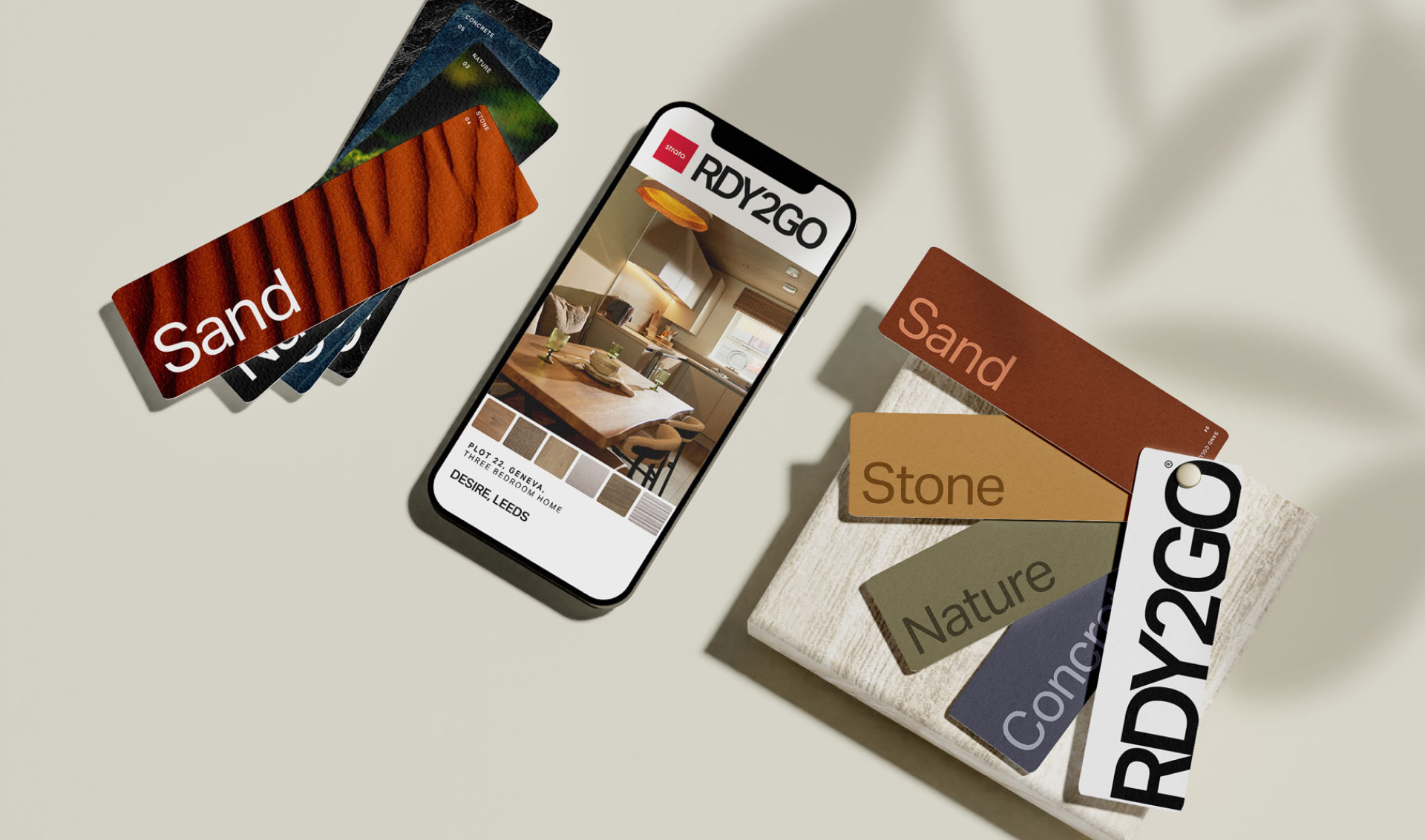
The customer research showed that potential buyers were sometimes overwhelmed when it came to designing their home, choosing their fixtures and finishes to transform it from a blank canvas. This inspired the six pre-defined styles that would become synonymous with Strata’s RDY2GO collection, and transform the humble “stock plot”, into a stylish, designer home.

The objective
First and foremost, this new RDY2GO collection had to successfully sell these previously less favoured plots. It also had to successfully change homebuyers’ perception of these pre-built homes as leftover, to carefully considered, highly desirable and interior design led homes. It was also key that these RDY2GO homes inspired a sense of speed, both in terms of urgency to reserve your chosen home but also speed to completion, hence the name RDY2GO.
But first, we needed to create the RDY2GO collection itself
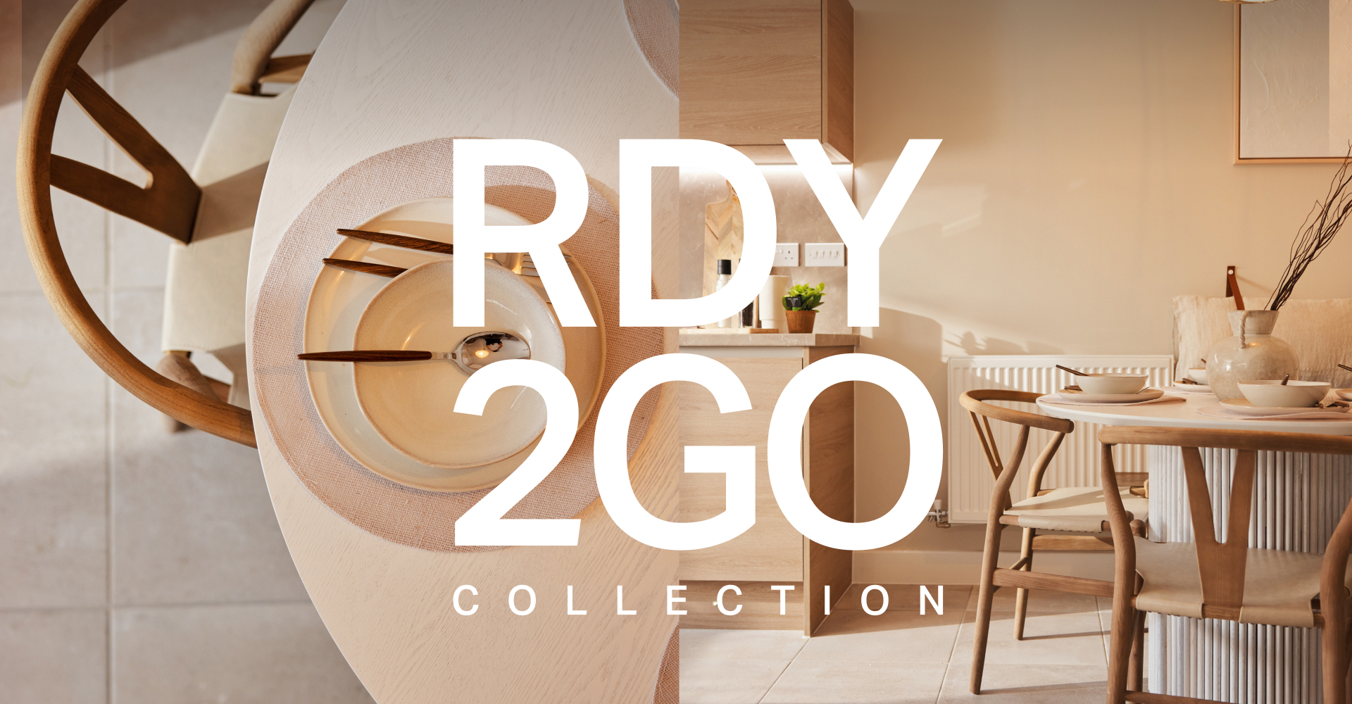
Working alongside interior designers, a series of styles for the homes were created and our digital designers translated this into a complementary style for the website. The six series were: marble, stone, nature, sand, concrete and slate.
A landing page was created to introduce the RDY2GO concept, and the six new interior design series. This landing page then drilled down into individual plot pages for each home, where potential buyers could explore more details about the home and the series it belonged to. Listing pages for specific locations were also introduced to support the visibility of this content from location led searches and last but by no means least, a bespoke Salesforce integration ensured these RDY2GO plots could be tracked from landing page to reservation and beyond.
A new concept needed a new user experience
With style designed into every aspect of the RDY2GO project from the plots to the web pages, it was important the user experience delivered the same style and attention to detail. Our amazing front end development team set to work using scroll driven animations to support users navigating this new content. On plot landing pages, collection headings were made sticky while backgrounds change and new images scale in and move out in different directions as the user scrolls.
The full screen layout also reimagines the scroll animation into a swipe transition reminiscent of flipping between the pages of high-end interior design magazines. Meanwhile on the homepage, visual impact is delivered through a hero image that stays fixed in place and fills the screen as users scroll through the introductory content. A CSS grid is used to create the layout for the plot listings too, allowing users to toggle effortlessly between a full width and column layout, seamlessly repositioning the same elements into the different structures on demand.
The result is a sleek, engaging user experience that gives the effect of pages stopping in place while different, engaging scroll animations play out on screen
